Bad copywriting is something I complain about quite a lot – sometimes it’s because it’s poorly proofread (and I start planning the Alex Mitchell School Of Copywriting), sometimes it’s trying too hard to be something it’s not, sometimes because one tiny phrase just annoys me. Today, I’ve seen two bits of copywriting I really liked.
The first was this post from meebo about how they went about designing the ads for their site. It feels very open, which is what’s going to be useful in persuading a user base not only to accept something new, but also to use it. Things are presented as suggestions and opinions, but the fact that ads are going to be there is not open for questions; it’s a post about how to make the best of what the site have done, not about what the site have done.
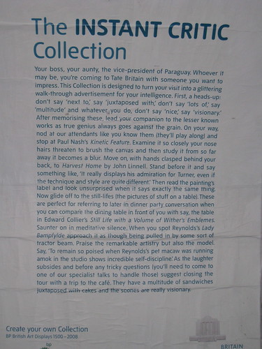
The second is from Tate Britain:

It’s fun, enough so that you can miss things while reading it quickly, and it plays on the ideas of the Tate collections being pretentious, while mentioning enough different pictures and styles to make it sound interesting. I always enjoy an obvious punchline, too, which probably helps.

1 response so far ↓
1 Tamlyn // Nov 12, 2008 at 2:42 pm
Ha ha! Pictures of stuff on a table will never look the same again.